Saturday 20 November 2010
Friday 20 August 2010
Laptop death
Lesson of the day: Always Back Up. Daily.
I sadly did not and with my the exploding of my hardrive i appear to have lost of lot of my third terms work. shit.
Tibits Restaurante
Heres a viral video i helped make with Amp, for Tibits restaurante. It was a fun day.
Tuesday 13 April 2010
Sunday 4 April 2010
Friday 2 April 2010


These were meant to be the final pin up for the presentation on the last day of term. We also had t-shirts, stickers and the models made, just to show how far Noob Music could go. Peter, however hurt his back so instead of a crit we dressed up in suits and went to the bar. Hopefully should have a crit wen we start the summer term. So should be trying to improve this project. Haven't got round to it yet though...
Sunday 14 March 2010
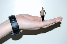
 Got some final ideas for what the Noob should look like and i decided to create a 3D pop out version of the Noob. I think this could be a good way to promote the music channel and obviously when MTV decide to release this channel we should get loads of viewers...But here are what the Noob would look like and also a 'noob entertainment system' NES! the final Noob design is going to be changed to have antenna for the N on his head.


Wednesday 10 March 2010
NOOB MUSIC
Peter Chadwick, from Popular Design has set us a brief to create a music channel. Me and Sophie have decided to do it on the music of video games! Stuff like this:
There are lots of interesting design ideas that i think can come from this project. We want the channel to be current and colourful, with modern references to japenese culture. As its called Noob Music we have also decided to come up with a character called the 'Noob'. Here are a couple of early design concepts for a 3D version.( its meant to say noob on its side)


Tuesday 9 March 2010
Saturday 6 March 2010
Inspired Motion graphics
 This is the plan for my motion graphics video with Charlie Brooker ranting brilliantly about what he would do if he was in charge. I want to get the camera to pan over the words twisting and following as each word is revealed (through after effects). Its going to be a massive learning curb, but i'm really looking forward to the final piece.
 AMP
 Amp is a great creative agency based in london, that happens to be run by my brother. They've worked for some big clients, from the likes of Marriot hotels to the RSPCA and produced some fantastic work over the past few years. Their new website is now up and running so check it out for some great work. www.amp-london.com


Roll On Bad Type.

The brief was to seek out, spread and celebrate bad typography, whether it be shop signs, pizza menus or number plates. Often its easier to know what not to do than what to do and this was the idea behind the project. My team and me came up with the concept of wallpaper, and trying to surround ourselves with bad type. It was also interactive and gave people a chance to vote on what they thought was the worst type. We loved the repeat patterns and would like to take the idea further to thing such as table clothes and t-shirts. Here is the finished wallpaper, and a test we did in a bar.


Friday 5 March 2010
Saturday 20 February 2010
Friday 19 February 2010
Them Bones
Sunday 31 January 2010
Thursday 28 January 2010
Sunday 24 January 2010
Sunday 3 January 2010
Not Working
I have therefore done no work.
This is not good.
I'm going to do something before i go back.
Quite what to do i don't know yet...
I have therefore done no work.
This is not good.
I'm going to do something before i go back.
Quite what to do i don't know yet...
Friday 25 December 2009
MOON
Tuesday 22 December 2009
Thursday 17 December 2009
SHRINE

Above is Mine and Emma's final shrine to Gadgets and old school music. With help from our tutors we found that repeat patterns were the best way to achieve beauty in the randomness of wires surrounding our vinyls. The idea that the symmetrical patterns would create shapes and forms for the viewers eye to wander through really works. This was one of many repeat patterns we tried and we favored this one because of how the wires flowed, or even grew out of the four plug sockets located in the corners.
Subscribe to:
Posts (Atom)


